GOD SAVE DESIGN
Before I leave for Philadelphia to do another campus visit – and thus go for another couple of days without fulfilling my writerly duties here – I wish to leave you with one of my favorite designs – along with a view thoughts about it. I am referring to the classic 1977 poster by Jamie Reid for the Sex Pistols. [I have a link to a brief history of Jamie Reid over to the right.]
If you haven’t figured it out by now – and through my work – Punk has had a significant influence upon my visual activity; not just as an aesthetic understanding, but as a political, social, and cultural philosophy, as a response to and extension of the Student Revolution of 1968, as a form resistance to cultural apathy. Punk – if examined in it depth and breadth – was a remarkable critique, one that was highly literate, culturally self-aware, and artistically progressive: see The Velvet Underground, The Talking Heads, Devo, Siouxsie and The Banshees, et al.
Jamie Reid is perhaps the designer most closely associated with Punk – having worked with Malcolm McLaren before the whole Sex Pistols thing; McLaren brought Reid on board when the Pistols took off. While most of you hopefully know the God Save The Queen posters, this one – my favorite – is a little less well remembered, perhaps because it is a bit too complex to undergo the popular packaging of punk that far too often reduces its intellectual undercurrents.
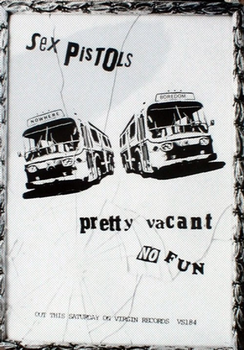
 Anyway, this is Reid’s poster for the release of the Pretty Vacant single – No Fun was the B-side. [click image to the left to enlarge] Note the ripped off typography, the two buses going to NOWHERE or BOREDOM, the ornate frame – part of the poster – and shattered picture glass, not to mention the extreme refusal of color – part intent, part necessity. This poster contains a wonderfully subtle set of iconography that belies the simplistic interpretation of punk, a subtlety rarely seen in design these days.
Even though I feel a certain nostalgia for punk – can it really be nostalgia since I pretty much missed it when it was around? – looking back at Reid’s work also gives me hope for future possibilities, that design can still speak like this. Reid’s designs made a claim, a demand on viewers; it spoke with conviction and searched for ways to meaningfully convey alienation of a generation of disenfranchised youth – this poster perhaps better than any other of its period. Visual proclaiming that we could go – it isn’t that hard; just catch a bus – but there really is nowhere to go, or if there is it will be the same as here. Reid – though he grew up in suburbia – captured and created the anti-suburban impulse remarkably in his work; perhaps never better than with the shattered glass from a fist striking out in impotent rage at the narrow social mandates of the, at that time, recently settled self-satisfaction of suburban consumerism.
I could go on about this for hours, but today I am busy. So, dear readers, I leave you with Jamie Reid.
Fuckin’ right.
If you haven’t figured it out by now – and through my work – Punk has had a significant influence upon my visual activity; not just as an aesthetic understanding, but as a political, social, and cultural philosophy, as a response to and extension of the Student Revolution of 1968, as a form resistance to cultural apathy. Punk – if examined in it depth and breadth – was a remarkable critique, one that was highly literate, culturally self-aware, and artistically progressive: see The Velvet Underground, The Talking Heads, Devo, Siouxsie and The Banshees, et al.
Jamie Reid is perhaps the designer most closely associated with Punk – having worked with Malcolm McLaren before the whole Sex Pistols thing; McLaren brought Reid on board when the Pistols took off. While most of you hopefully know the God Save The Queen posters, this one – my favorite – is a little less well remembered, perhaps because it is a bit too complex to undergo the popular packaging of punk that far too often reduces its intellectual undercurrents.
 Anyway, this is Reid’s poster for the release of the Pretty Vacant single – No Fun was the B-side. [click image to the left to enlarge] Note the ripped off typography, the two buses going to NOWHERE or BOREDOM, the ornate frame – part of the poster – and shattered picture glass, not to mention the extreme refusal of color – part intent, part necessity. This poster contains a wonderfully subtle set of iconography that belies the simplistic interpretation of punk, a subtlety rarely seen in design these days.
 Even though I feel a certain nostalgia for punk – can it really be nostalgia since I pretty much missed it when it was around? – looking back at Reid’s work also gives me hope for future possibilities, that design can still speak like this. Reid’s designs made a claim, a demand on viewers; it spoke with conviction and searched for ways to meaningfully convey alienation of a generation of disenfranchised youth – this poster perhaps better than any other of its period. Visual proclaiming that we could go – it isn’t that hard; just catch a bus – but there really is nowhere to go, or if there is it will be the same as here. Reid – though he grew up in suburbia – captured and created the anti-suburban impulse remarkably in his work; perhaps never better than with the shattered glass from a fist striking out in impotent rage at the narrow social mandates of the, at that time, recently settled self-satisfaction of suburban consumerism.
I could go on about this for hours, but today I am busy. So, dear readers, I leave you with Jamie Reid.
Fuckin’ right.


1 Comments:
I am loving your blog man. I'm putting you on my blog roll.
Post a Comment
<< Home